A Solution to Rural Isolation in Africa

What is Lambda School?
Lambda School is a 7+ month accelerated program with an immersive
hands-on curriculum with a focus on computer science, software engineering, and web development.
What is Lambda Labs?
In the last month at Lambda School, students participate in Lambda Labs. In this program students work in teams for 1 month and work with a stakeholder to create a product that helps to solve a problem. Sometimes students start from scratch, other times they inherit a previously worked on product.
Background:
My team consisted of 3 front end engineers and 5 data scientists. The front end engineers front end framework of the project was React, we used context API to do state management and worked with a Mapbox wrapper for React called react-map-gl to render the map in the React app. The data science team worked on cleaning the data and creating a data science API that the app could connect to and grab data from.
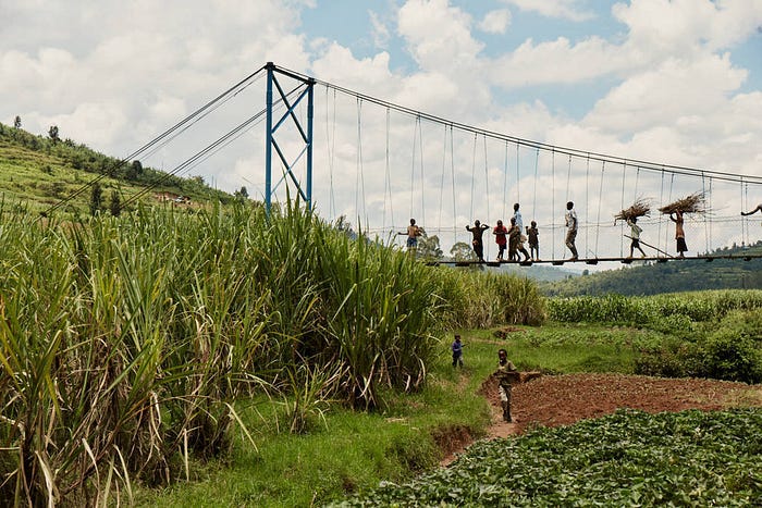
The stakeholder for the project was Bridges to Prosperity. In Africa, rural communities can have trouble accessing basic things such as healthcare, education, markets and job opportunities due to the amount of distance that needs to be traveled as well as paths being blocked due to flooding. Bridges to Prosperity is a non profit organization that solves this lack of access by building footbridges. Thanks to the footbridges there is better access to non agricultural jobs. The overall health of the communities increases due to easier access to clinics. Lastly, children no longer miss school due to river floods blocking their path to school.
Initial Concerns:
One of the things that intimidated me about this project was that it was the first time that I had ever inherited a previously worked on React project. Up until this project I had always created my own React projects, by myself or with teams from start to finish. I wasn’t sure how readable the code would be or what state the project was in or how usable the project already was.
Roadmap & Planning:
The 2 main goals for the font end web team were to
- Improve the map visualizations
- Incorporate impact visualizations to show how the availability of a bridge impacted a community
One of the first things that I decided to do was work with my team to figure out what our user stories would be. A user story essentially describes how a user will interact with the product. The first step in generating user stories was to have a meeting with the stakeholder to understand the direction that they envisioned the product would go. Then I created a user flow diagram to determine how a user will flow through the product and make user interactions. I then broke down each user story into a display, decision and action. I also checked to see if that user story fit within the MVP of the project and aligned with the stakeholder’s vision.
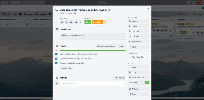
A user story I created was that a user should be able to click multiple filters on the map at the same time and display different map pins.To break this up into individual tasks, one thing I thought about was the knowledge that would be required to complete the user story. Since the team and I lacked knowledge of how Mapbox worked I set that as the top task for completing the feature.
Another task for this user story was figuring out how state was manipulating the map and how the app as a whole functioned. Since this project was inherited, a major hurdle for finishing the user story was understanding how everything in the app was constructed and connected to one another.

Technical Challenges:
To create the ‘user can select multiple map filters’ user story, which I will now refer to as the ‘multiple active filters’ feature I first examined how state was being managed. The state management chosen by the previous team that worked on the project as mentioned previously was context API. All of the state was centralized in a store app and then distributed as needed to various components.

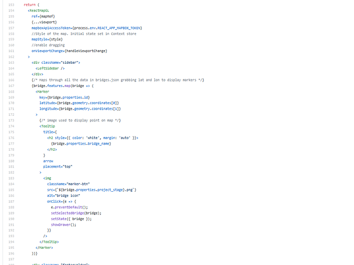
I then looked at the map component to figure out how the map was rendering and how it was receiving the external data that it needed. This was the first technical challenge I encountered. Since, this was my first exposure to Mapbox I looked up any code I didn’t recognized in Mapbox’s amazing documentation and was able to piece together how the map was rendering.

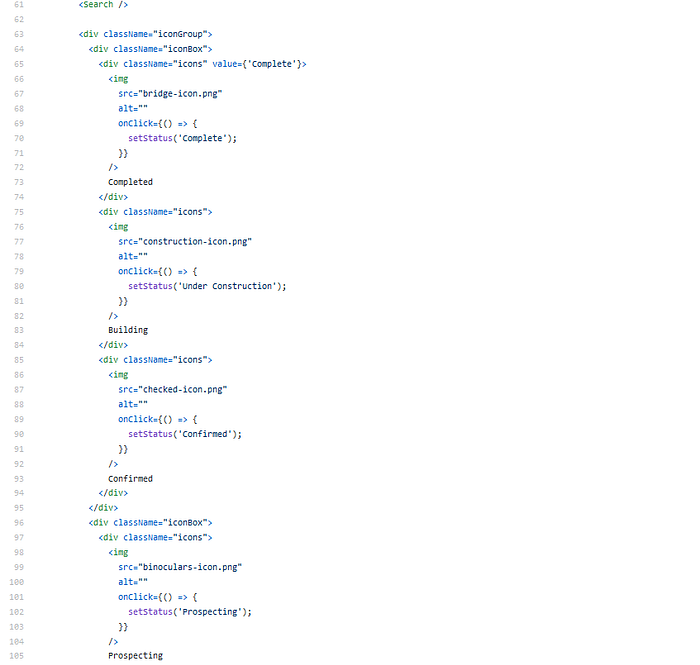
After that I examined the LeftSidebar component which housed the search functionality and filters. It allowed me to piece together how those two features were connected to the map.

Once I identified those 3 components and gained an understanding of how they currently functioned I was able to begin thinking of ways to modify the current functionality. My original plan for implementing the multiple active filters feature was to create a status state per filter to track which filter was active, checking if a filter’s status was active and then making a copy of the data from the GET request to the data science API per active filter, filtering the data per active filter and then combining all of the data into a single array and feeding that data to the map so that the map pins can render per filter.
In the deployed feature I went a different route however. After explaining my plan to another team member, we were able to come up with a more simplified plan. We used a single activeFilters state which contained an empty array and every time you clicked a filter button it made a copy of the activeFilters array, inserted a string of the filter name to the activeFilter’s array and then filtered the entire data set to only include data where the bridge opportunity matched a string from the activeFilters array, allowing those data points to render on the map. On a 2nd click it would filter the activeFilters array removing the clicked on filter’s name from the activeFilters array, thus it would no longer render data points matching that project_stage on the map.

A blocker that I ran into while implementing this strategy, was that to get my click handlers that were on my filter buttons to work properly I needed to do a separate click handler function per filter. I noticed right away that this wasn’t a DRY solution and very little code was different per function. I eventually was able to implement a reusable handleClick function that utilized helper functions to add and remove filters from the activeFilters array.

The biggest challenges that my team had with the project as a whole were a repo swap that happened in the 2nd week of working on the project and the lack of good documentation for react-map-gl. In the middle of the 2nd week of working on the project my team was informed we had been given the wrong repo to work out of and we were given a new repo. At first it didn’t seem so bad since no code had been committed at that point but, I quickly realized that all of the code in the new repo was different from the old repo. This required my team to quickly redo our planning phase and come up with a new plan that more accurately reflected our new repo.
The 2nd challenge was with the documentation for react-map-gl. React-map-gl is a wrapper for Mapbox gl built specifically for React vs. Mapbox gl which uses vanilla JavaScript. React-map-gl lacked examples in their documentation and the few examples that were there referred to Mapbox’s documentation which had examples in vanilla JavaScript. To overcome this hurdle my team needed to spend more time reading and translating the Mapbox examples into workable react-map-gl examples.
Deployed Features
Listed below are the features my team was able to complete.
- Connected front end to a new data science API
This allowed for more accurate and up to date data to be used in the app.
- Multiple active filters
This increased the user experience and allowed for comparisons on the map to be made between data points.
- Map clustering
Combined nearby groupings of data points on the map into a single data point. Resulting in increased performance of the map & improved map readability
- Dashboard containing graphs, charts, and tables to visualize bridge data
This allowed for more granularity of the data and enabled for more visualizations outside of the map.
Future of the project
One of the next steps for the front end of the project would be to add the ability to hover over areas of the map and have it change color based on the data collected about the area from the DS API. This was a feature that I was working on and unfortunately was not able to complete before the end of my time with the project. An issue that I foresee is figuring out which parts of the data should affect the hover functionality. There will also be issues with getting the hover functionality working since the react-map-gl documentation for hover functionality points to the Mapbox docs which are using vanilla JavaScript.
Another next step would be fleshing out the data dashboard that was implemented. In the deployed version of the site the dashboard contains a lot of placeholder data visualizations that were created to show to the stakeholder that it was possible to implement a dashboard into the site. Figuring out what visualizations to use to measure the data will be a hurdle that will probably require input from the next data science team.
Lessons Learned
I also was able to get valuable feedback from my peers that I worked on the project with. Towards the end of the project everyone gave each other feedback on how we thought individual team members performed. My team members typically described me as hardworking and dependable. One of my peer reviews from a team member described me as,
“someone who was easy to work with and someone that follows through on the task at hand”
When working on teams I never want to be the person that’s considered dead weight or unreliable so I always try extra hard and make myself available to any team members that need me.
Team members also thought I could do better at articulating my ideas and plans. This will be something that I will try to be more mindful about in future projects. In the future I will try to think about how I want to explain my ideas, ahead of time to minimize any potential confusion or misunderstanding and make my thoughts clearer and more concise.
